The Shift from Pensions to 401KsThe concept of retirement has changed drastically over the past 45 years. Retirement for our parents relied on their Social Security income and their Pensions. A pension was basically a Lifetime Contract. You received a fixed monthly income for the rest of your life, and some pensions also included cost of living increases! Pensions today are being replaced by 401Ks and IRAs. These are merely different methods of saving money for retirement. There is NO CONTRACT and when the money runs out, the income stops, and stock market volatility and taxes can play significant roles in how long our savings will last. Longevity is becoming a major factor in our retirement. Will you outlive your money?
This lack of Guaranteed Lifetime Income has resulted in a significant shift in the age when many of us are starting our Social Security Benefits. 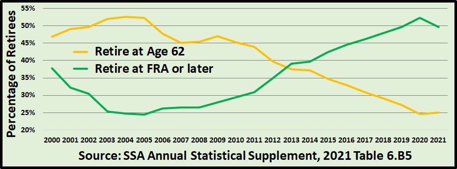 The 2004 Social Security Statistics indicated that 52.65% of all Americans started their benefit at age 62 while only 24.75% had reached their Full Retirement Age or older. The 2019 statistics now show that only 27.3% are starting their benefits at age 62 while 49.7% are waiting until their full retirement age or later. That more than a 25% shift in the last 15 years! As pensions are being replaced by individual savings, our only source for guaranteed lifetime income is becoming our Social Security benefits. Many of us are beginning to realize that starting our benefit at the lowest possible guaranteed income level at the earliest possible age is not the best strategy to insure a livable income for the remainder of our lives. This is the normal view of Stock Market Risk.When you search the Internet for graphs of the historic performance of the S&P or other market indexes, they will show you the results on a linear or logarithmic scale. All of the charts that you see show the same historical �growth� of the markets. 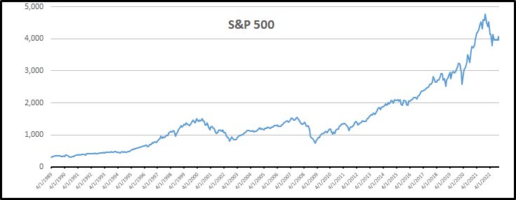 The scale of this S&P graph is logarithmic, it shows a few bumps here and there, but it also illustrate the nice steady increase in the market when you stick with it. In my personal opinion, this is not the proper way to look at the market as something that you can Risk your personal retirement lifestyle on. This is our custom view of Stock Market Risk.How does the annual Rate of Return of the S&P 500, calculated each month, compare to the Annual Inflation Rate for each year? 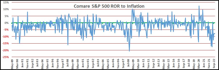 The normal jagged uphill growth chart of how the S&P has done over the past 50 years is relatively useless during retirement. How did it do last month and the month before? What can I expect next month? Don�t we all wish we had that answer! Our chart is not an accumulation of 50 years of data. It is the yearly results of the previous year calculated each month for the past 824 months! Each monthly data point starts at ZERO, not the sum of all the previous data points! The scale on the left is the percentage change each year, not the current growing value if you stay invested for 50 years! How did we create this graph and what does it say?
The final results over the 824 monthly data points were; the S&P 500 had an 8.82% average yearly increase while the average yearly inflation was 3.50% over the same time period resulting in the S&P beating inflation by 5.32% as a yearly average. The stock market actually beats inflation by 5.32% on average each year! But, when you look at the actual line on the graph, there is absolutely no way that you should risk your retirement on your investments beating inflation by anything, much less 5.32% each year of your retirement. You could be facing a short term loss of over 40% like we had at the end of 2008 or a long term loss of over 20% a year starting at the end of 2000 and lasting until mid 2003!  Now let's move on to discuss some of the alternatives that are available for our 401Ks. Next - Tax Free Roth Accounts and Annuities! |
|||||||||||||||||||||||||||||||||||||||||||||||||||||||||||||||||||||||||||||||||||||||||||||||